
Right-click View > Show Rulers & Guides to set the Snap to Grid and Snap to Guides options.
|
|
Right-click View > Show Rulers & Guides to set the Snap to Grid and Snap to Guides options. |
Rulers and guides are activated by the Show Rulers & Guides toggle. The unit of measurement – mm or inches – defaults to the regional settings in the MS Windows® Control Panel. The ruler scale adjusts with the current zoom setting. Guides can be used separately or in addition to grid lines for detailed work.
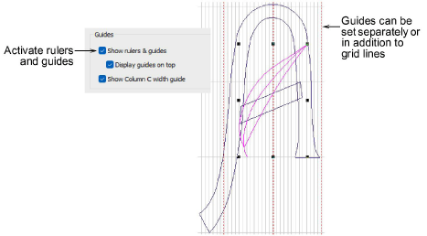
Tip: By default, any guides you bring into the design window appear on top of embroidery, vectors, and bitmaps. By unticking the ‘Display guides on top’ checkbox, guides appear beneath.
The Show Column C Width Guide option activates a special cursor with the Column C tool. A circle appears at the cursor position corresponding to the width setting in the Object Properties docker. This is useful when digitizing a border based on a background image. When the offset is biased, two circles are shown, one for each side.
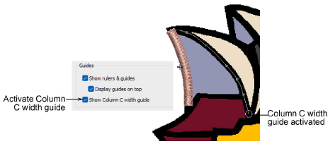
To gain the benefit of the width guide, you must accept the current width setting by pressing Enter, rather than digitizing reference points after finishing the centerline.
Tip: Depending on the colorway, you may need to adjust guide display colors in order to view them against the background color.
3Display grids, rulers & guides
Products
EmbroideryStudio Add-ons
Solutions
Learning
Support
Connect
About Wilcom